fifty/fifty coffee and tea
Delicious coffee, lackluster space.
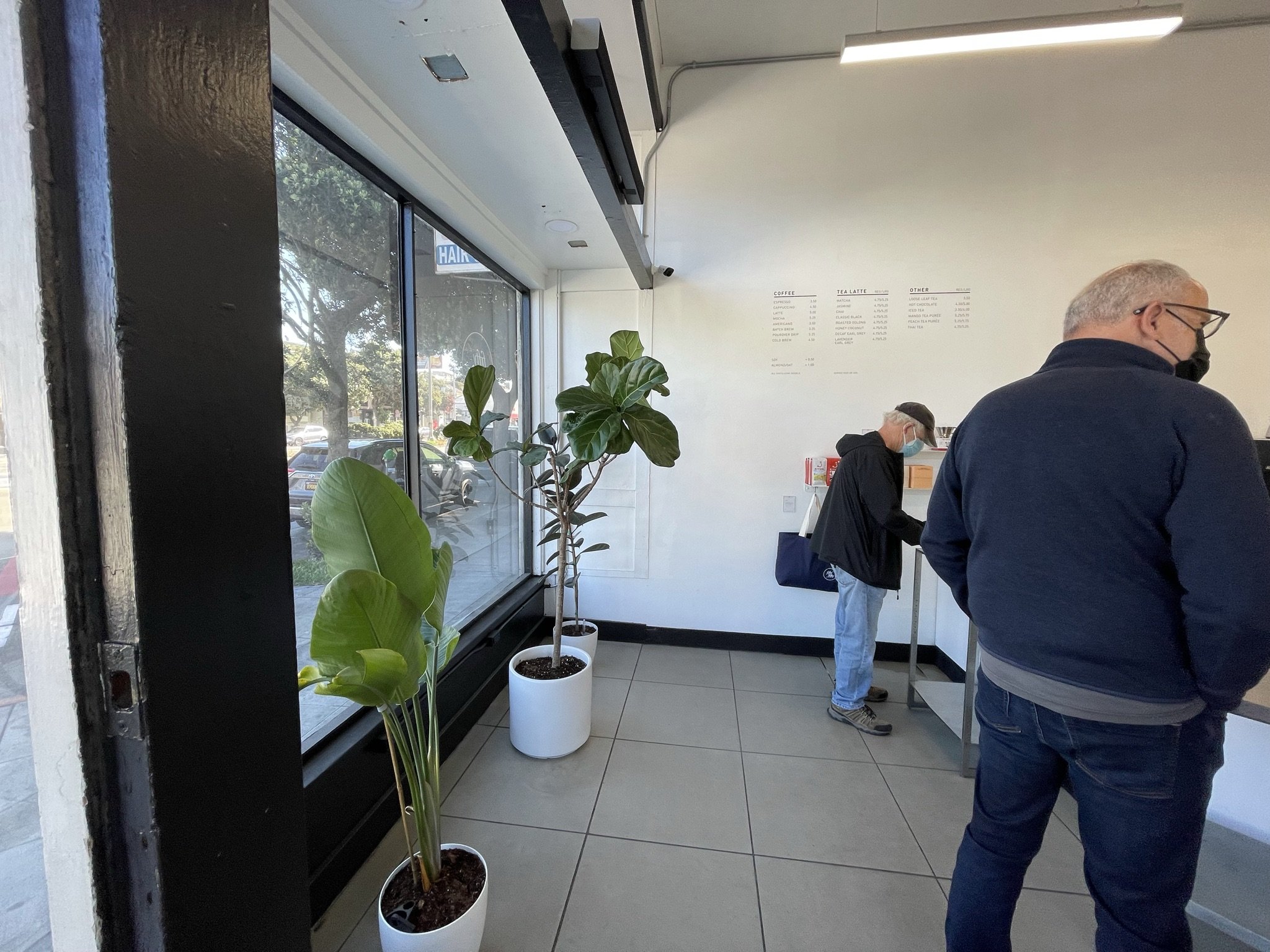
fifty/fifty is a coffee shop located on busy Geary Avenue in San Francisco. It offers excellent coffee and tea products, but houses them in a bland, mismatched space.
My proposed architecture/interior design renovation evokes the fifty/fifty branding, offers are more dynamic and welcoming space for coffee shop customers, and provides a distinction of employee and customer zones.
Existing Photos


Proposed Design
Issues:
Bland walls, mismatched decor
No recognizable fifty/fifty branding
Undefined employee/customer spaces with exposed equipment
Institutional lighting
No customer seating
Solutions:
Define the space with color, texture, and artwork
Evoke the fifty/fifty branding with painted geometry, add signage and branding. Provide space to showcase products for sale
Separate counter equipment with a taller partition and glass- for privacy and sanitation
More strategic lighting to create zones of defined activity and use. Add pendant lights to distinguish the counter
Reintroduce customer seating with a bar at the window, tables and chairs, and a bench near the pick-up counter


A few aesthetic changes make a huge difference for this coffee shop!
The major design change in this proposal is the black accent wall. It celebrates the height of the space, while defining the service area, and evokes the fifty/fifty slash. The black wall at the rear of the space also offers an excellent opportunity for branding with a large, lighted logo. Behind the kitchen area, shelves were added to enhance the store’s merchandise display.
To save money and reuse the existing infrastructure, counters and kitchen equipment stayed in place but received new cladding. A privacy partition was added to separate the customer and employee spaces and hide the appliances.
New lighting, wall art, menu board, and seating add texture and definition to serving and seating zones. The variety of seating options allows patrons to comfortably wait for their order at the rear bench, relax at a table, or people watch at the front window.
The space is dynamic, interesting, and promotes the brand and culture of fifty/fifty. Patrons will remember this space and return to enjoy tasty coffee and cool vibes.


Team
Architecture/ Design: Caitlin Brady